Style Guide·2 min read
The Ultimate Guide to Color Matching Outfits for Impact
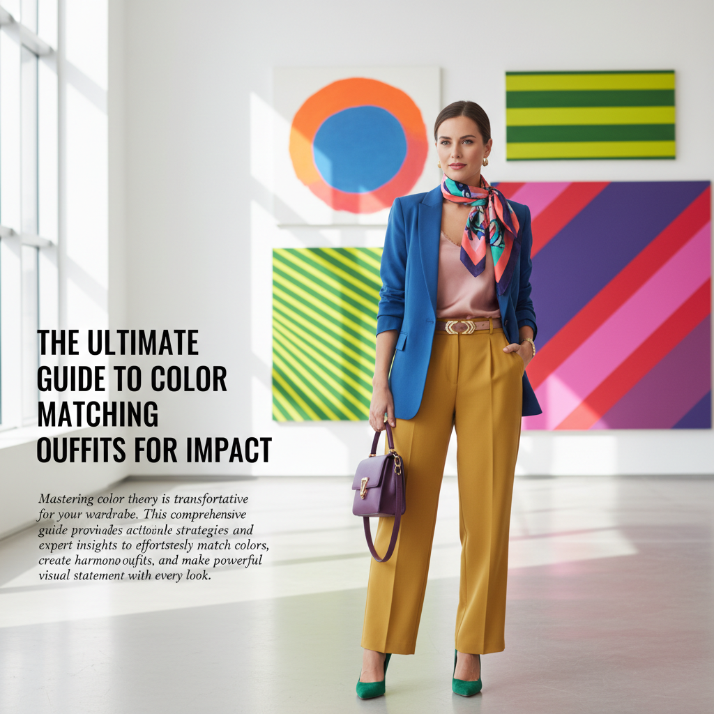
Mastering color theory is transformative for your wardrobe. This comprehensive guide provides actionable strategies and expert insights to effortlessly match colors, create harmonious outfits, and make a powerful visual statement with every look.
color matchingstyle guidefashion tipswardrobe harmony
Why Color Matters in Your Outfits
Color is the first thing people notice. It impacts mood, perception, and how you're perceived. Understanding color theory allows you to craft outfits that are not just visually appealing but also strategically communicate your desired message.
The Color Wheel: Your Best Friend
The color wheel is fundamental. It organizes colors by hue, showing their relationships:
- Primary Colors: Red, Yellow, Blue (cannot be mixed from others)
- Secondary Colors: Orange, Green, Violet (mixed from two primaries)
- Tertiary Colors: (mixed from a primary and a secondary)
Key Color Matching Techniques
- Monochromatic: Using different shades and tints of a single color. Example: light blue shirt, navy trousers, royal blue blazer. Creates a sleek, sophisticated, and elongating effect.
- Analogous: Using colors adjacent to each other on the color wheel. Example: yellow, yellow-green, green. Produces a harmonious, calm, and natural look.
- Complementary: Using colors directly opposite each other on the color wheel. Example: blue and orange, red and green. Creates high contrast, vibrancy, and a bold statement. Best used sparingly or with one color as an accent.
- Triadic: Using three colors evenly spaced on the color wheel. Example: red, yellow, blue. Offers a balanced and vibrant contrast, often seen in playful or artistic styles.
Tips for Flawless Color Combinations
- Start with Neutrals: Black, white, grey, navy, and beige are foundational. They pair well with virtually any color and can anchor more vibrant pieces.
- Consider Your Skin Tone: Warm skin tones often suit earthy colors, gold, and warm reds. Cool skin tones shine in blues, greens, silvers, and cool reds. While not a strict rule, it can guide your choices.
- Balance Brights with Darks: If wearing a bold color, balance it with a neutral or a muted tone to prevent the outfit from overwhelming.
- Texture Adds Depth: Even in monochromatic outfits, varying textures (e.g., a silk blouse with wool trousers) adds visual interest without introducing new colors.
- Accessorize Strategically: Accessories are perfect for introducing pops of color or subtly tying together different hues in your outfit.
Common Color Mistakes to Avoid
- Overdoing It: Too many clashing bright colors can look chaotic. Stick to 2-3 main colors, with one dominant.
- Ignoring Undertones: Wearing warm tones with cool undertones (or vice versa) can wash out your complexion. Pay attention to how colors make your skin look.
- Forgetting Proportions: Bright colors draw attention. Use them on areas you want to highlight, and darker, more neutral colors on areas you want to downplay.
Ask Mirror's AI can provide real-time feedback on your color combinations, helping you refine your choices and master the art of color matching.
Frequently Asked Questions
- What is the easiest way to start matching colors?
- Begin with monochromatic or analogous schemes. These are inherently harmonious and less prone to clashing, building your confidence with color.
- Can I wear multiple bold colors together?
- Yes, but it requires careful execution. Use the triadic or complementary principles, and ensure colors are balanced, perhaps with one dominant and others as accents.