The Ultimate Guide to Color Matching Outfits for Maximum Impact (V3)
Unlock the power of color in your wardrobe with this comprehensive guide. Learn advanced color theory, foolproof combinations, and how to create outfits that truly make a statement and reflect your unique style. Go beyond the basics to master impactful color matching.
The Ultimate Guide to Color Matching Outfits for Maximum Impact (V3)
Color is arguably the most powerful tool in your fashion arsenal. It can evoke emotions, communicate personality, and instantly elevate an otherwise simple outfit. But how do you go beyond basic pairings and create truly impactful, memorable looks?
This guide will take you deeper into the art and science of color matching, moving from fundamental principles to advanced techniques that will help you create stunning outfits every time.
1. Revisit the Color Wheel: Your Foundation
Before we dive into advanced strategies, a quick refresh on the color wheel is essential. Understanding the relationships between colors is the bedrock of successful matching.
- Primary Colors (Red, Blue, Yellow): The base from which all other colors are mixed.
- Secondary Colors (Orange, Green, Purple): Created by mixing two primary colors.
- Tertiary Colors: Created by mixing a primary and a secondary color (e.g., red-orange, blue-green).
Key Color Relationships:
- Analogous: Colors adjacent on the wheel (e.g., blue, blue-green, green). Create harmonious, calm looks.
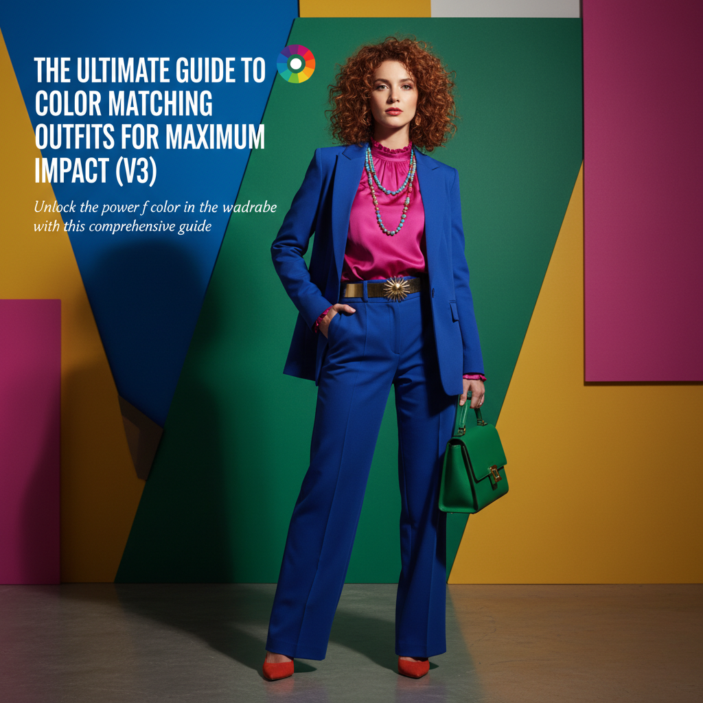
- Complementary: Colors directly opposite on the wheel (e.g., red and green, blue and orange). Create high contrast, vibrant, and energetic looks.
- Triadic: Three colors evenly spaced on the wheel (e.g., red, yellow, blue). Offers strong contrast while maintaining balance.
- Monochromatic: Different shades, tints, and tones of a single color. Creates sophisticated and cohesive outfits.
2. Beyond Basic Matching: The Art of Tones, Tints, and Shades
The vibrancy and depth of a color drastically change how it interacts with others. This is where understanding tones, tints, and shades comes in.
- Tint: A color mixed with white (e.g., pink is a tint of red).
- Shade: A color mixed with black (e.g., burgundy is a shade of red).
- Tone: A color mixed with gray (e.g., dusty rose is a tone of red).
Impactful Tip: When combining colors, aim for similar tones or saturations. Pairing a muted olive green with a vibrant fuchsia can clash. Instead, pair muted tones with other muted tones, and bright, saturated colors with other brights.
3. The Power of Neutrals: Grounding Your Palette
Neutrals (black, white, grey, beige, navy, olive, brown) are not just safe options; they are strategic building blocks that allow other colors to shine.
- Anchor Brights: A vibrant top paired with neutral bottoms prevents the outfit from being overwhelming.
- Create Balance: Neutrals provide a visual break, making complex color combinations feel more put-together.
- Elevate Textures: A monochromatic neutral outfit becomes impactful through varying textures (e.g., a chunky knit sweater with sleek leather pants).
4. Advanced Color Strategies for Impact
a. Split Complementary
Instead of using a direct complementary color, use the two colors adjacent to its complement. For example, with blue, instead of orange, use yellow-orange and red-orange. This offers a vibrant contrast that is slightly softer and more sophisticated than a direct complementary pairing.
b. Tetradic (Double Complementary)
This uses two complementary pairs, forming a rectangle on the color wheel. For example, blue and orange, plus red and green. This is complex but highly rewarding when executed well, requiring careful balance of saturation and distribution.
c. Analogous with an Accent
Take your harmonious analogous scheme and introduce a small pop of a complementary color. For instance, a blue and green outfit with a small red accessory (a scarf, bag, or shoes) provides a surprising and impactful focal point.
5. Considering Your Personal Coloring and Occasion
While rules are helpful, remember that personal style and context matter.
- Skin Tone: Certain colors naturally flatter different skin tones. Experiment to find what makes you glow.
- Occasion: A highly contrasting, bold color scheme might be perfect for a creative event but less suitable for a formal business meeting.
6. The Ask Mirror Advantage
Still unsure if your chosen colors match? Upload your outfit to Ask Mirror! Our AI provides instant, objective feedback on color harmony, fit, and overall impact, helping you confidently master color matching and create truly outstanding looks.
Frequently Asked Questions
- What is the 60-30-10 rule in fashion?
- The 60-30-10 rule suggests that 60% of your outfit should be your dominant color, 30% a secondary color, and 10% an accent color. This creates a balanced and visually appealing distribution of colors.
- How can I incorporate bold colors without feeling overwhelmed?
- Start small by introducing bold colors through accessories like a handbag, shoes, or jewelry. You can also pair a single bold piece with an otherwise neutral outfit to make it pop without feeling overwhelming.